A/B test on 16,000 users: what matters more in a survey tool — price, design, or conversion?

  • Reading time:3 mins read
  • Post last modified:15.05.2026

So here’s what happened — I was sure the cleaner, more modern WebAsk would beat the heavier, visually dated Alchemer on conversion. An A/B test on 16,000 users said otherwise.

Alchemer is a tool for building surveys of any complexity. As a UX researcher, I need a serious tool. A month in, I started to respect Alchemer for how much it can do. But the dated survey interface kept bothering me. So when the team at WebAsk offered to test their tool, I said yes right away.

I expected the cleaner WebAsk interface to build more trust and lift response rates. Especially on mobile, where visual clarity usually matters more.

I was wrong. Here’s how it played out.

The A/B test

I sent 8,074 push notifications for each survey variant. Same text, same send time, same survey logic, same wording. Results and takeaways at the end.

Comparing the survey interface

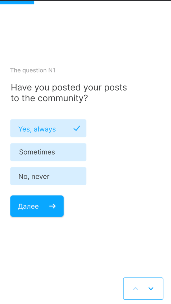
WebAsk looks more modern: more breathing room, cleaner typography, less visual noise. The kind of thing that usually reduces cognitive load — the mental effort users spend just parsing the screen.

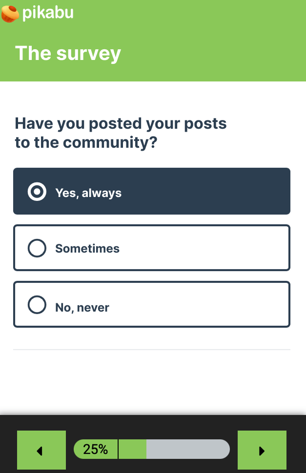
The one thing I’ll give Alchemer here is survey branding. Below — the same question in both tools.

Alchemer screenshot
Alchemer survey user interface
WebAsk survey user interface

Survey features

The survey had branching logic — questions that depended on earlier answers. Setting this up in WebAsk was harder than it should have been, mostly because my mental model was already shaped by Alchemer. I got there in the end.

Working with reports in WebAsk is rough. You can’t drop outliers or test responses, filter by answers, or compare segments. Yes, you can export a CSV — but that just moves the work to my side.

One thing I’ll give WebAsk credit for — passing hidden parameters through the URL. Alchemer auto-generates the link for segment tracking. I prefer the hidden-parameter approach. More flexible.

Alchemer is many times more expensive

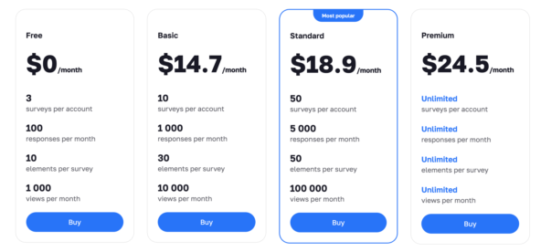
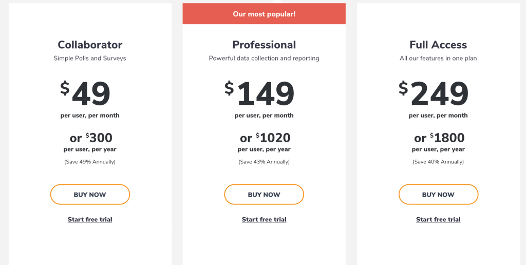
The price gap between these tools surprised me. The top tiers differ by 10x.

Fair warning — comparing WebAsk and Alchemer pricing head-to-head isn’t quite fair. Alchemer sells functionality and depth of setup. WebAsk sells simplicity and sample volume.

The structure is different too: Alchemer tiers limit features, WebAsk tiers limit your sample size. Take that with a grain of salt when you read the numbers.

Screenshot of the cost of tariffs from the website webask.io 01/25/2022
Screenshot of the cost of tariffs from the website alchemer.com 01/25/2022

Results

Conversion to survey open — summary table

Conversion to the first question was clearly lower for WebAsk (7.6%) than for Alchemer (8.7%). And it was lower in every user segment — s1, s2, s3.

Alchemer vs Webask: A/B-тест сервисов опроса

Takeaways

The result caught me off guard. The more modern WebAsk interface lost to Alchemer on conversion in every single segment.

I’m still chewing on why. Could be load speed, branding, or just how familiar the interface feels. But here’s the hypothesis I’m sitting with: in the context of surveys, people may trust “heavier” and visually conservative interfaces more.

WebAsk looks nicer — and I caught myself falling for the halo effect. Alchemer is the more professional tool. You’ll pay more for that.

A good reminder for me: a clean interface doesn’t always build trust. Sometimes it makes the product feel too light.